Overview
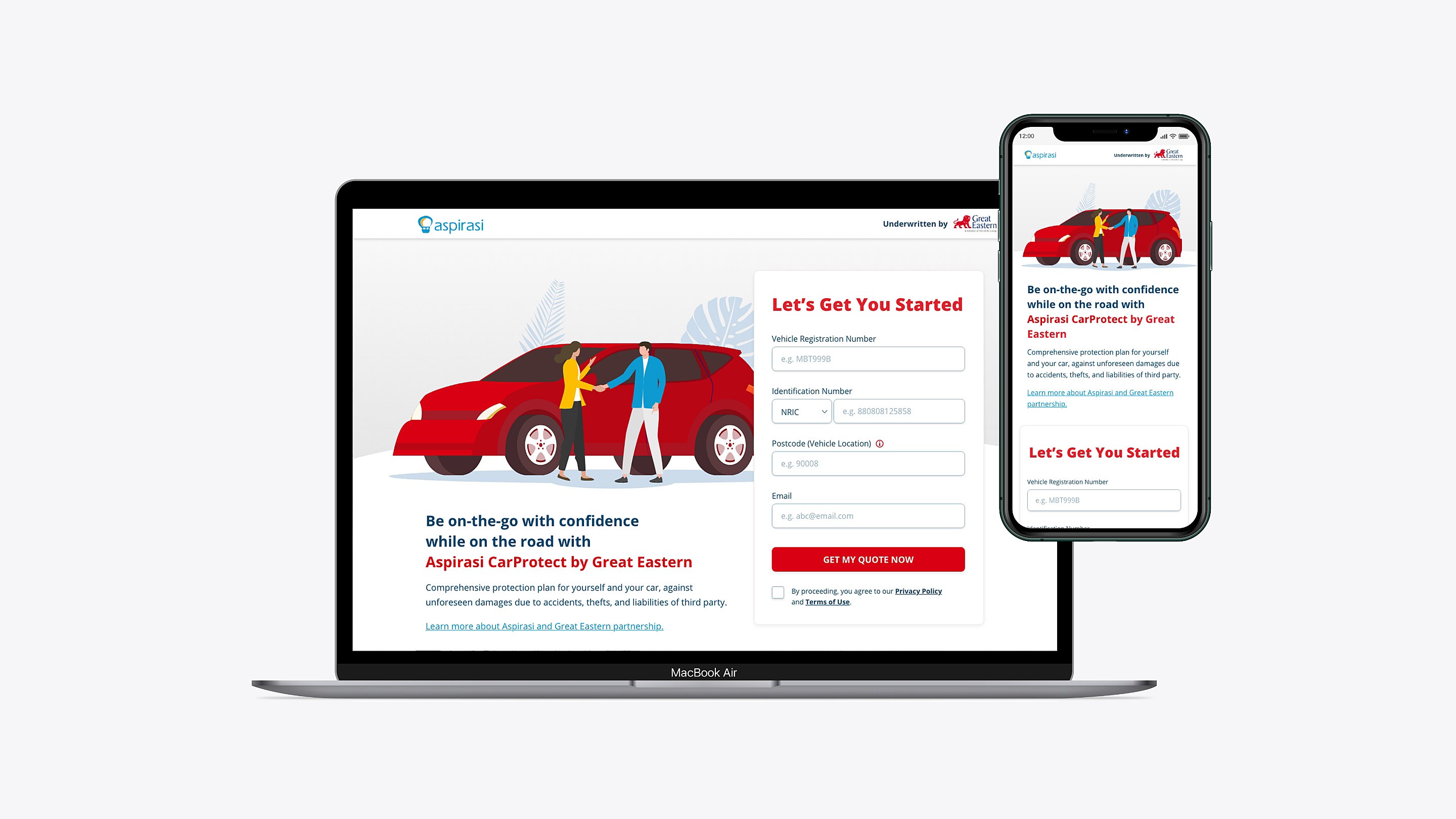
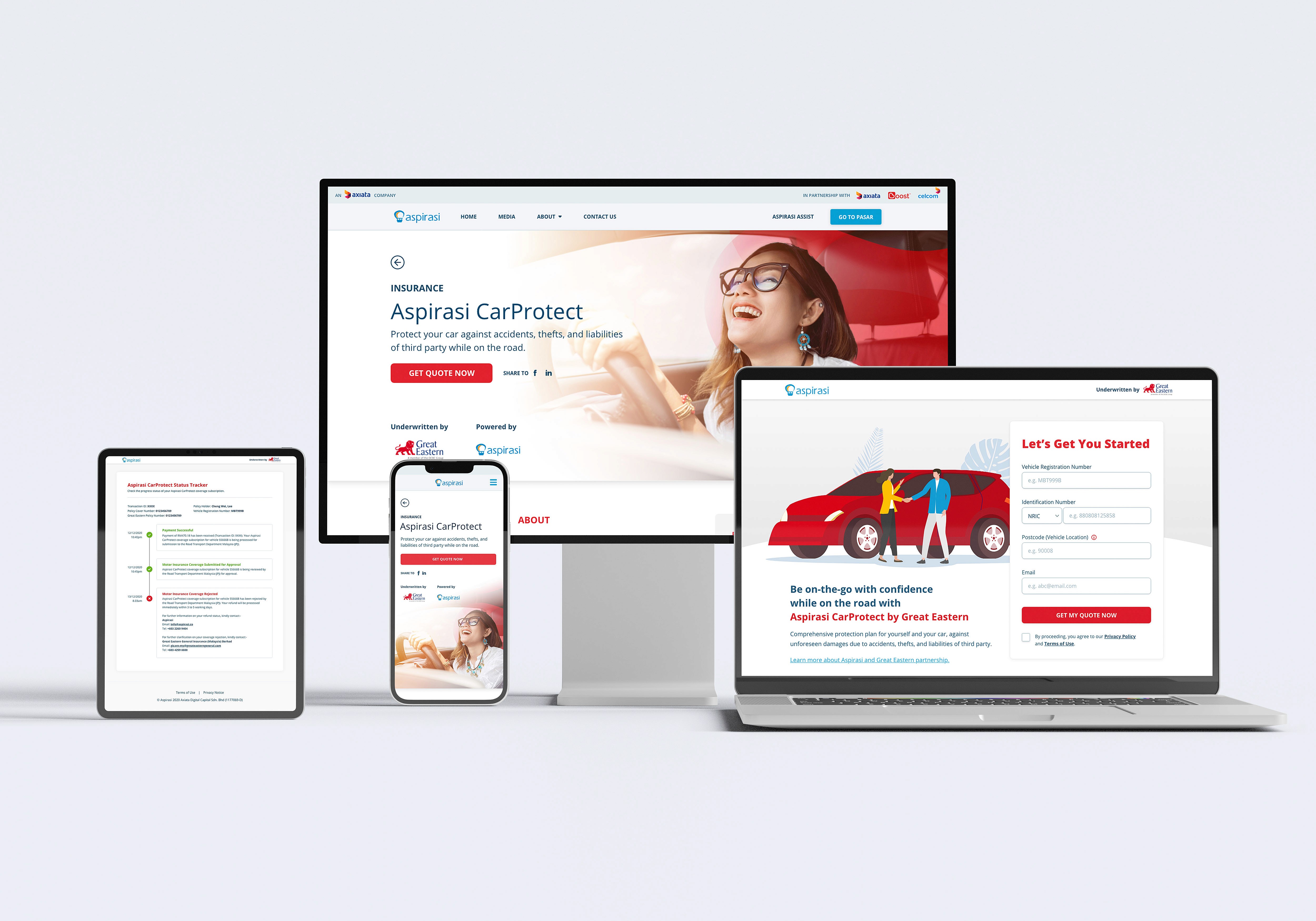
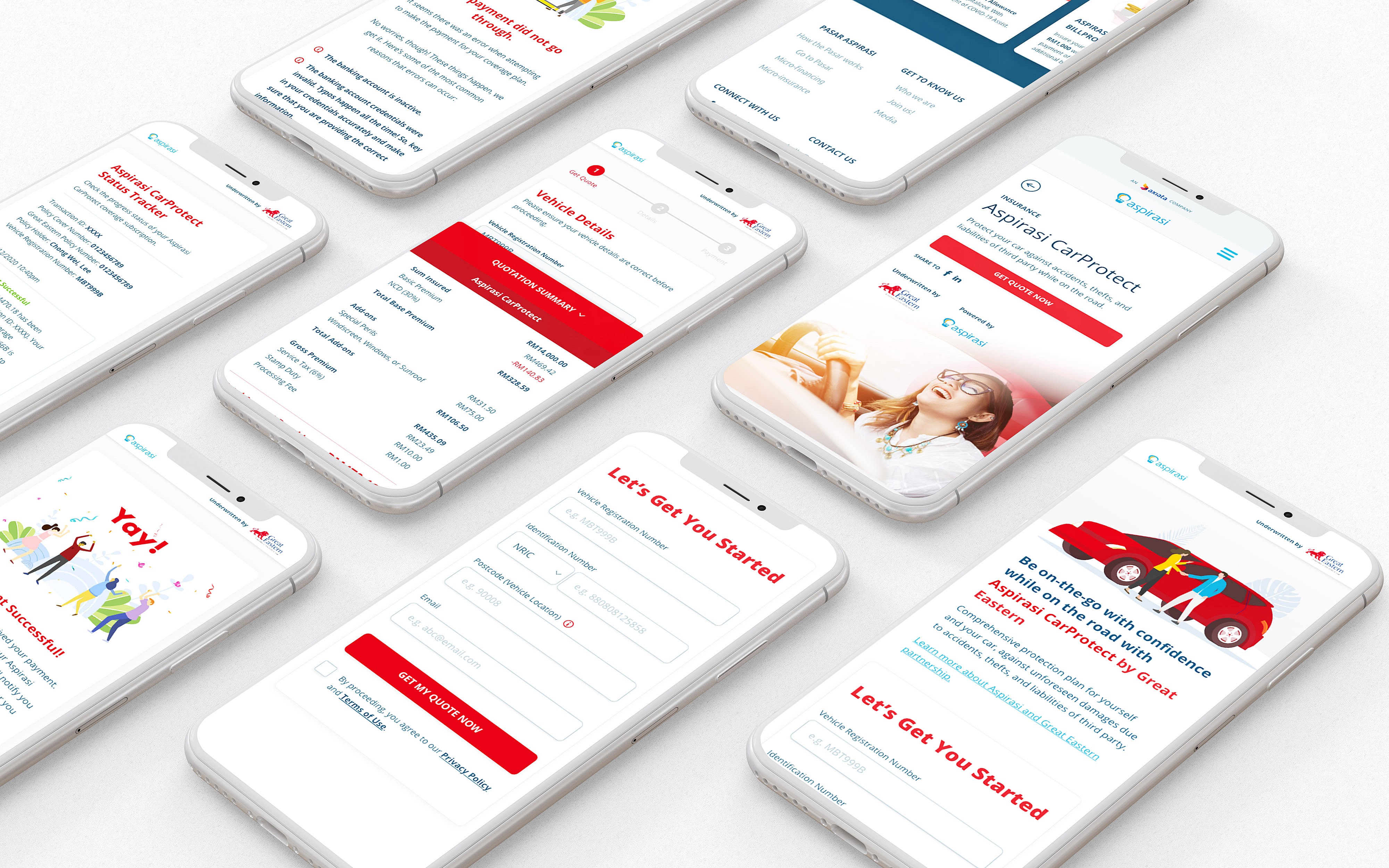
Aspirasi Axiata (now known as Boost Credit), the fintech arm of Axiata Group partnered up with Great Eastern since 2020 to provide digital insurance offerings. They launched their motor insurance product with a digital journey - CarProtect, in June 2021.
Running on Lean, I spearheaded the UI/UX as lead designer for all things insurtech in Aspirasi Axiata.
For this product, I led the entirety of the design ideation; from conducting a comprehensive competitive analysis and user research, crafting wireframes, to refining them into a final prototype.
CarProtect was launched in June 2021. You may view the live version of the product page here.
(Aspirasi has been rebranded as Boost Credit).
My Role
Product Design, UX Research, UI Visualisation
Methods & Tools
Competitive Analysis, User Research, Interaction & Visual Design, Prototyping, Adobe XD
Date
February 2021 - June 2021
The Process
Competitive Analysis
CarProtect was a more comprehensive purchasing insurance journey; which was quite a step up from the other digital insurance products I’ve worked on in Aspirasi Axiata. I did an extensive market research and competitive analysis on various motor insurance journeys to gain better insights into the process in line with understanding our business requirements and insurance regulations. I delved deep into understanding how customers navigate the purchasing process, from obtaining quotes to comparing add-on coverage options and eventually completing the purchase journey.
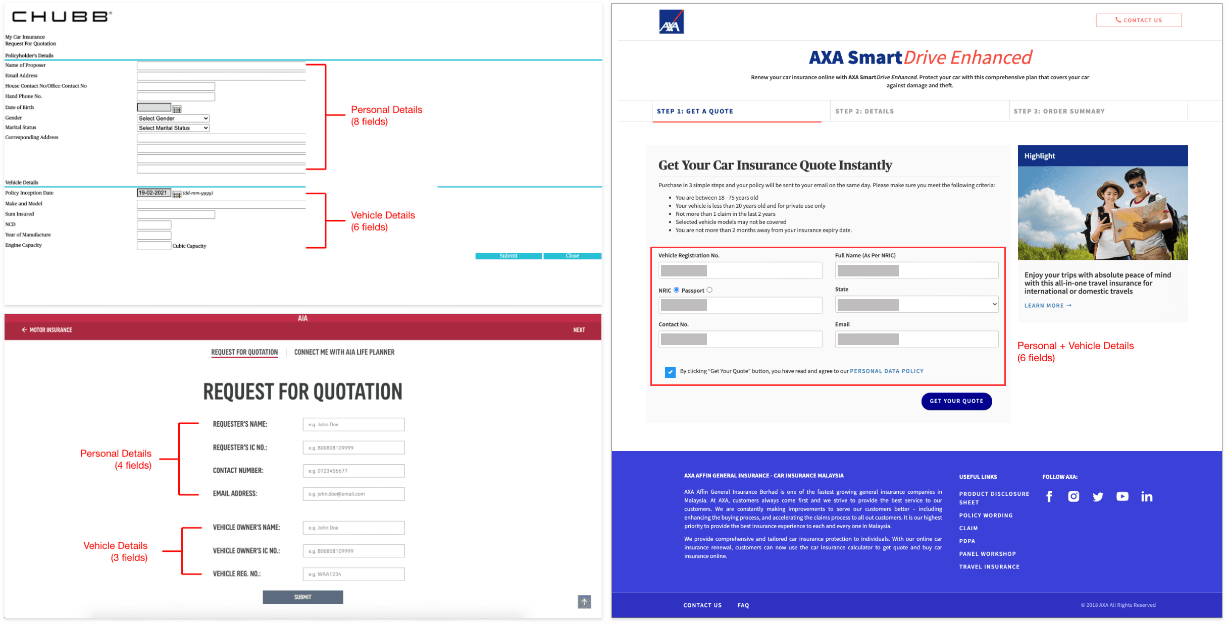
I needed to study the different competitors in the market and the extent of basic user information that was required before a price quotation could be generated. I researched 10 insurance providers as well as 3 insurance aggregators. I studied:
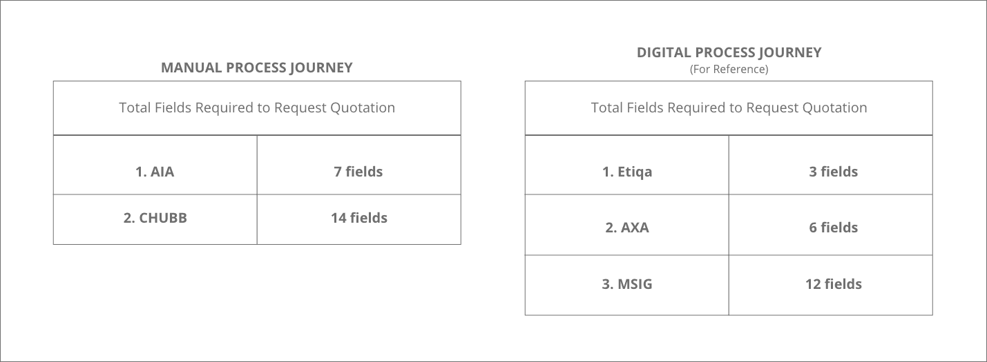
the number of text fields and information needed before a quotation could be generated
that some providers and aggregators are not full straight-through processing (STP)
the method of notifying user once quotation is ready (non-STP)
the turn around time for quotation generation (non-STP)
I then narrowed down my analysis to 5 insurance providers and segregated them to 2 different categories based on their purchasing journey (i.e. Hybrid Manual+Digital Journey and Full Digital Journey).
User Research
Additionally, the user research and testing also helped us to identify gaps and areas that needed iteration, providing us with a better insight on user needs and pain points. Unfortunately, I cannot share the details of my research findings, ideation, and the full processes due to a Non-Disclosure Agreement (NDA). If you're interested to learn more about my involvement in this project, reach out to me and let's chat!
Wireframe
Desktop Web
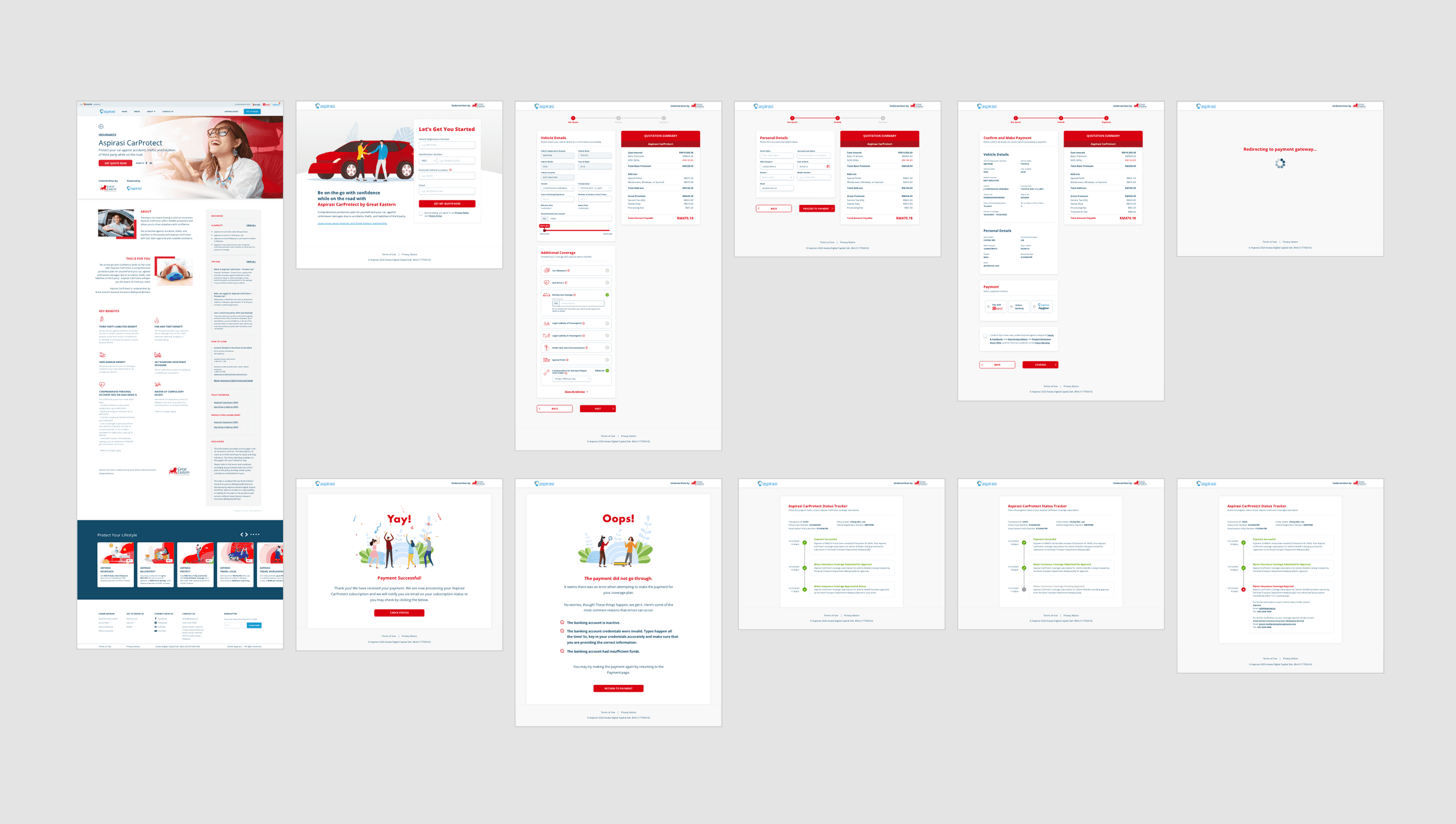
Some key wireframes for desktop web
Mobile Web
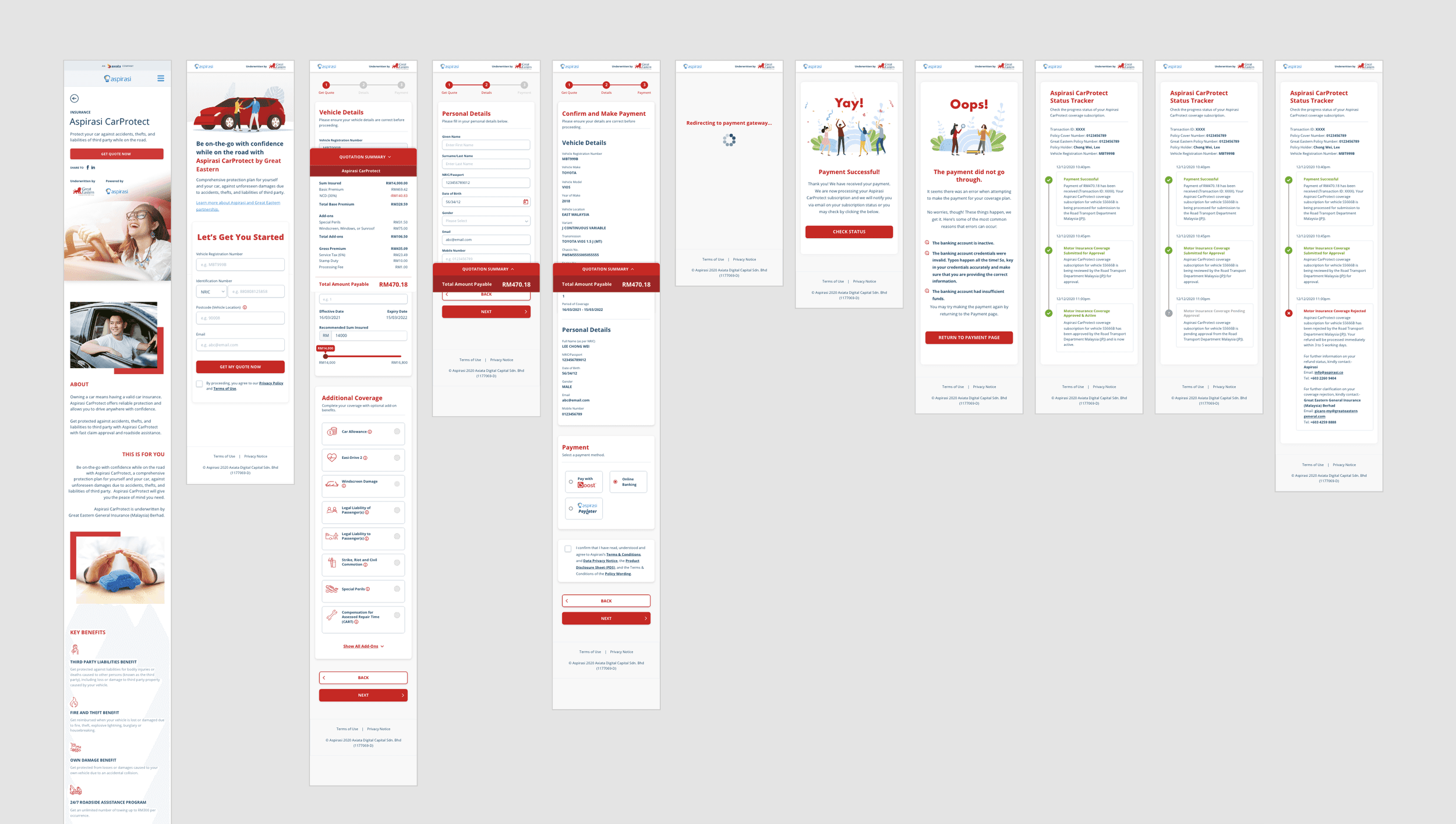
Some key wireframes for mobile web responsive
