Overview
We set out on a full-scale discovery process to explore how we can optimise lead generation and digital acquisition in the RHB website by enhancing its user experience. Our focus was broken down into several MVPs that targeted different product and customer journeys - from discovery to conversion. The goal was to identify the gaps within each journey and develop a strategic approach to address them efficiently, to validate our design solutions, and explore opportunities to streamline internal and external processes.
My Role
UX Research, UI Design
Methods & Tools
User Interview, Usability Testing, Affinity Mapping, HMWs, Prototyping, FigJam, Figma
Date
January 2022 - Ongoing
The Process
Given the large scale of this discovery phase, I worked closely with 2 other talented fellow UX designers and 2 amazing Business Analysts. We had the opportunity to collaborate with stakeholders from different product teams since it involves various product journeys within the site. The diverse collaboration was instrumental in shaping our research approach and problem-solving strategies as we incorporated insights from different angles to decide on a holistic solution that will enhance the customers’ product application journey and our internal lead management processes.
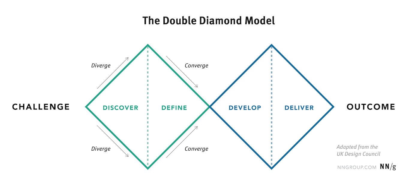
We applied the double diamond design thinking model to our exercise. For our User Research, we conducted a User Interview with 15 participants to gather insights on user behaviour and impressions. We also conducted a Usability Testing with 6 participants to validate existing journeys and identify pain points and UX gaps. Once we’ve gathered and synthesised the research findings, we conducted an Ideation workshop with stakeholders to work out a design solution together.
The exercise plus the insights obtained not only guided us in redesigning the website interface, but also allowed us to develop actionable strategies and recommendations to streamline the lead generation process and ensure a seamless product application and intuitive navigation experience for users.
Improvement
Since the implementation of some of our proposed recommendations we have seen a significant increase in CTA click-rates as the navigation architecture has been improved.
We introduced new entry points for users to be able to reach product pages and make an application instantly.
Product category consolidation has also been revamped to be more consistent with other products.
Unfortunately, I cannot share further details of our research explorations as this is an on-going project and it is still under development. Nevertheless, some features and MVP updates from our discovery efforts have already made their way into the RHB Website (more to come)!

